-
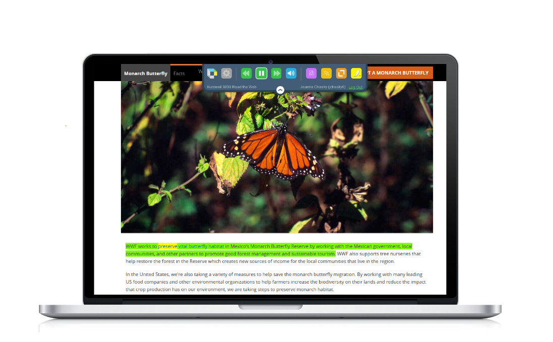
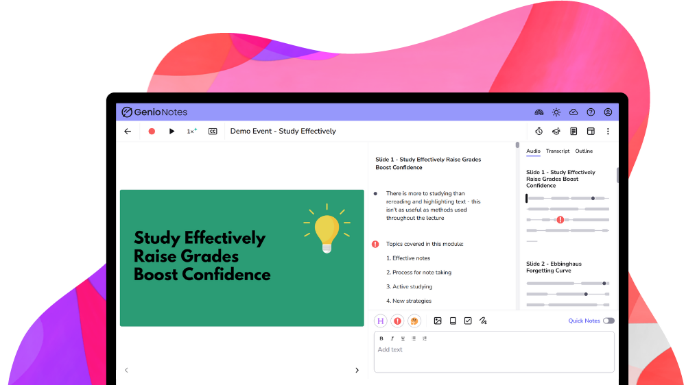
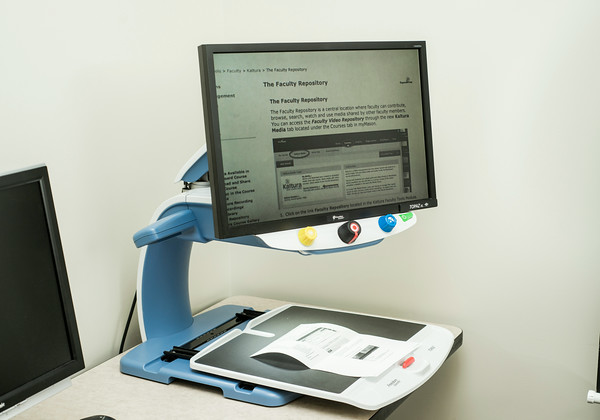
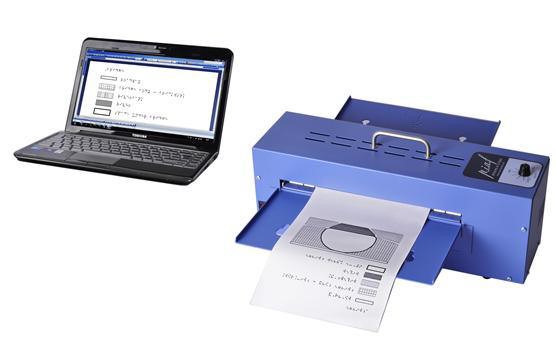
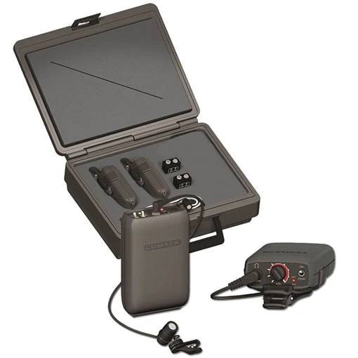
Organize notes, record lectures, type or write notes, to improve note
 taking skills, retention, and comprehension by allowing students to focus more on the course lecture content and less time taking notes.
 The ATI offers a number of options to support students with notetaking. The most commonly used solutions are as follows:
Notetaking & Organizational Resources
-

What is Assistive Technology?

AT Assessments & Referrals

Library AT Labs
Options for Typing with your Voice

Tools for Reading
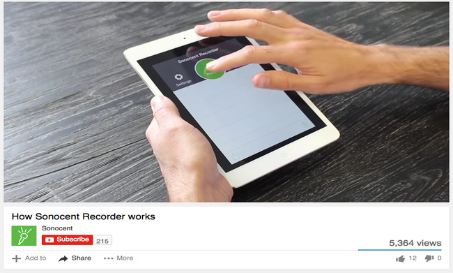
Tools for Notetaking

Tools for Writing
Tools for Individuals with Visual Impairments
Tools for Deaf or Hard of Hearing Individuals

Accessibility Tools for Mac & iOS
Accessibility Tools for Windows
Alternative Format Options in Canvas (Students)


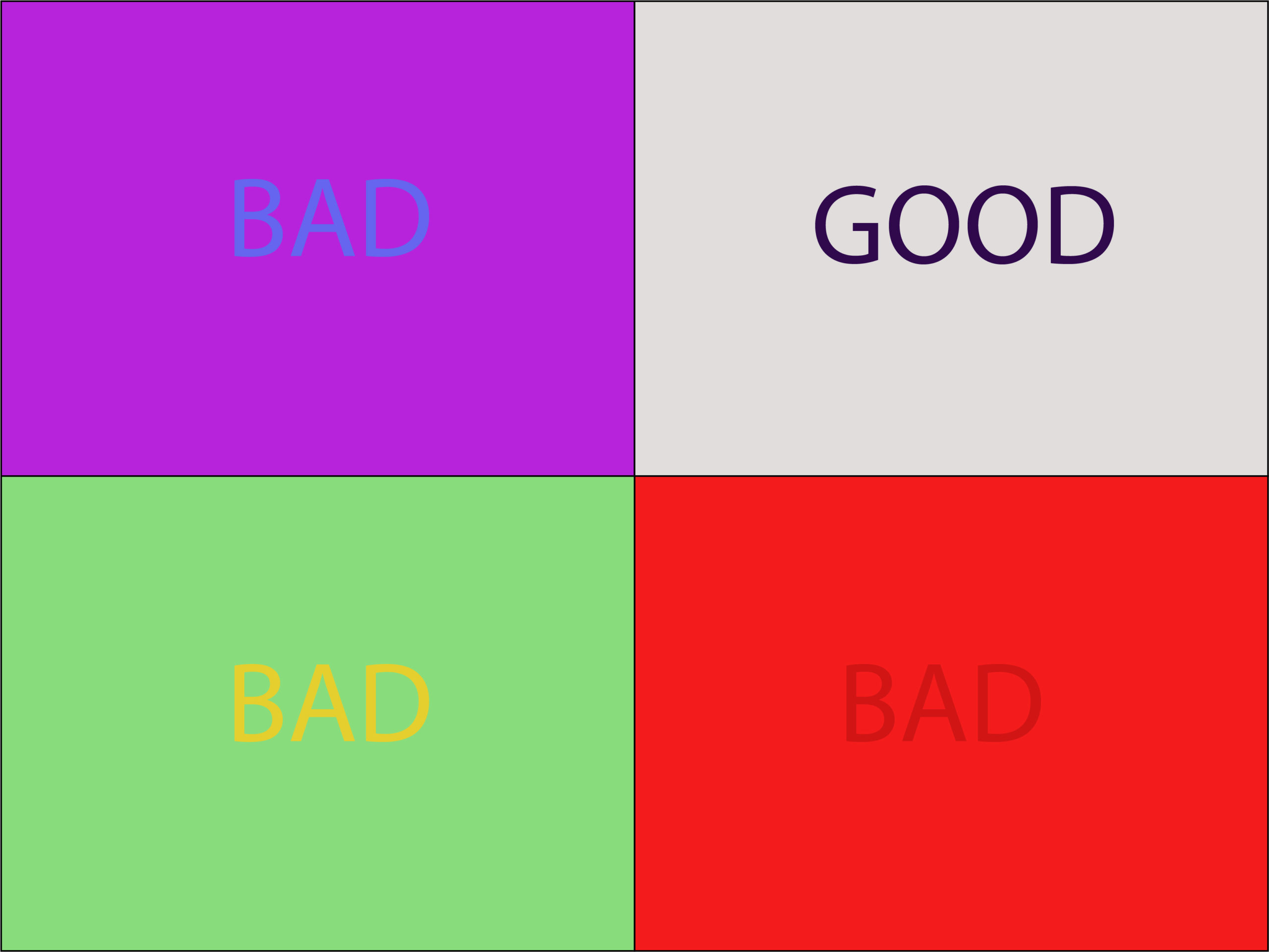
Good color contrast draws interest to important content on your course site.
Why is this important?
It also benefits individuals who may have colorblindness or those with low vision. The Web Content Accessibility Guidelines (WCAG 1.4.3 opens a new window) states that the contrast ratio for small text (~12 pixels or below) should be at least 4.5:1. For large text (~18 pixels or above) is 3:1.
To check the color contrast in your course site, do the following:
- Download and install Colour Contrast Analyser (by Paciello Group) opens a new window.
- Next, review the YouTube video below from Portland Community College on how to use the Colour Contrast Analyser (1:34):
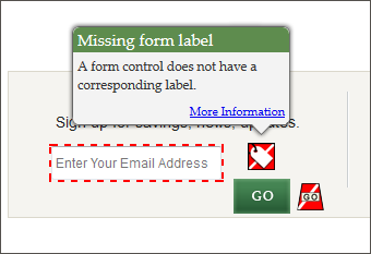
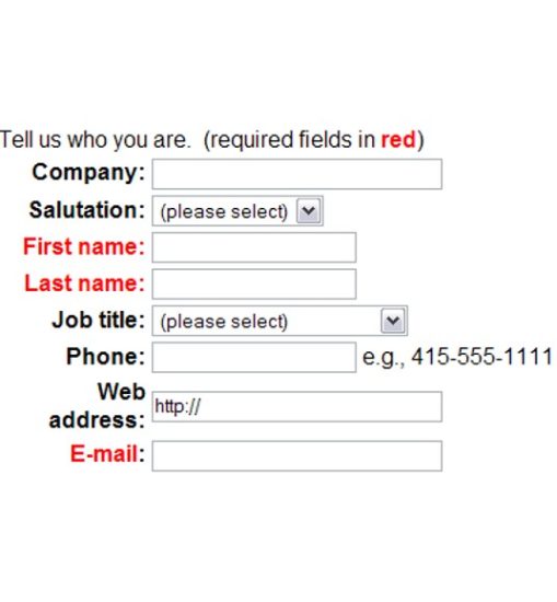
ADDITIONAL GUIDANCE FOR COLOR CONTRAST: Meaningful information should NOT be conveyed by color alone.
- E.g., the image below shows a web form with required fields identified by red text. If an individual is unable to see the color red, they would have difficulty filling out the form. A simple fix would be to add an asterisk(*) next to the required fields. This would then provide users who are unable to see red an additional piece of information to identify what is required.
-
Meet your 2025-2026 Trusted Testers!
-
Meet your 2026-2027 Document Accessibility Pros!
-
Meet your 2025-2026 Document Accessibility Pros!