Navigation mechanisms (e.g., headings, skip nav links, etc.) direct the user to key sections and/or pages of the site. These elements should be designed to clearly state their destinations and to indicate the current position of the user. They should also remain consistent visually and structurally from page to page.
We will review some of the more commonly used navigational mechanisms below:
Relevant WCAG Guideline(s): WCAG 2.1.1 (Keyboard) opens a new window, WCAG 2.4.1 (Bypass Blocks) opens a new window, WCAG 2.4.2 (Page Titled) opens a new window, WCAG 2.4.6 (Headings and Labels) opens a new window, WCAG 2.4.7 (Focus Visible) opens a new window
For information on how to create accessible hyperlinks, see below:
- Add a meaningful page title
- Add skip navigation links
- Use breadcrumbs for complex websites
- Creating/Customizing visual focus indicators
- Using heading tags
- Provide structure and functionality to carousels and slideshows opens a new window
- Additional resources
Add a meaningful page title
Page titles let users know what web page they are on. This is especially helpful for individuals with cognitive limitations (e.g., short-term memory loss) and blind/low vision users who rely on assistive technologies like screen readers to provide this information.
Add skip navigation links
Skip navigation, or skip nav, links provide individuals who can only operate a keyboard and/or those who use screen readers with the ability to “skip” past repetitive navigational elements on a web page (e.g., banner, main navigation bar, or search field) to the main content of a web page. Without these types of elements, individuals must use the keyboard to navigate through these repetitive structures on every page that is visited on a website.
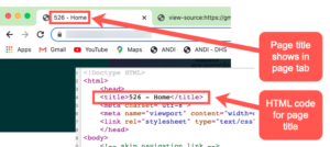
Skip nav links are designed by providing a hyperlink at the top of the web page which jumps the user down to an anchor within the main content section of that same web page. The skip nav link should always be the first item on the web page. The anchor should be placed at the beginning of the main content section of the web page. See below for an example of how this is done:
HTML code snippet:
<a href="#maincontent"/>Skip to Content</a>
....
<a id="maincontent"></a><h3>Home</h3>
Please Note: The skip nav link and page anchor are typically hidden be default; however, many web designers will make the skip nav links visible when a user navigates to it via keyboard. This allows those who can visually see content on the web page but using a keyboard the ability to take advantage of this feature.
Use breadcrumbs for large, complex websites
Sites that are large or complex could also benefit from navigational elements called breadcrumbs. Breadcrumbs typically appear horizontally across the top of a web page, below any title bars or headers and may look something like this:

The HTML code below highlights the strategy used in the image above for designing breadcrumb navigation into the website. The breadcrumb navigation is created using the HTML5 semantic nav element. You will also notice that the designer embedded a “hidden” h2 tag. For aesthetic purposes, this allows screen reader users to find the breadcrumb element without having to make the heading tag visible on the screen. Additionally, the h2 label “Breadcrumb” is used to define the nav element, which allows screen reader users to find this element when searching by page landmarks.
HTML code snippet:
<nav class="breadcrumb" role="navigation" aria-labelledby="system-breadcrumb">
<h2 id="system-breadcrumb" class="visually-hidden">Breadcrumb</h2>
<ol><li><a href="/">Home</a></li><li><a href="/student-life">Student Life</a></li><li>Where to Eat</li></ol></nav>
Creating/Customizing Visual Focus Indicators
WCAG 2.4.7 (Focus Visible) requires that any keyboard-operable user interface has keyboard focus indicator that is visible. In other words, it should be evident which elements on your website have focus when navigating using a keyboard.
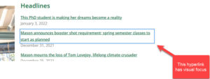
Visual focus indicators allow individuals to visually identify which navigable elements on a website (i.e., form fields, hyperlinks, etc.) have focus. This benefits not only keyboard users who rely on these indicators to know where focus is at any given time, but also individuals with cognitive limitations (e.g., short-term memory loss, attention deficits, etc.) who may sometimes lose the visual focus.
Let’s look at some examples from this video below:
Avoid using default browser focus styles
Most browsers have default styles for visual focus to assist keyboard-only users. The problem with the default styles is that they may not “play nicely” with the visual design of your website. The examples below were taken from Adrian Roselli’s blog post on Avoid Default Browser Focus Styles opens a new window. They demonstrate the challenges faced when using default browser focus styles:
Background Texture Example
Internet Explorer, Microsoft Edge, and Firefox all use a dotted line to indicate focus, which, as this example shows, can be a problem on textured backgrounds.
See the Pen
Insufficient Browser Default Focus: Texture by Adrian Roselli (@aardrian)
on CodePen.
Background Color Example
This example shows the problem most readily in Chrome (and Opera), which relies on a blue focus outline.
See the Pen
Insufficient Browser Default Focus: Color by Adrian Roselli (@aardrian)
on CodePen.
Are there specific styles we should be using?
There are many different ways to design your focus styles. The most important consideration is that they be easily identified by people using a keyboard and/or those with focus and attention limitations. Here are some examples to help you with getting started on your own:
- W3Schools – Using the CSS :focus selector opens a new window
- Deque – Tips for Designing Useful and Usable Focus Indicators opens a new window
Use heading tags
HTML heading tags are meant to give web documents structure, both visually and non-visually. They allow web content authors/web developers to “chunk” information, improving readability. Similar, screen reader users benefit by using a simple hotkey to navigate these elements.
Let’s look at an example of how screen readers use headings below:
Heading Hierarchy
Headings should follow a logical nesting hierarchy in your web document. The main heading of every web page on your website should be defined using a heading 1 tag (h1). The next level down (i.e., subheadings) should be defined using a heading 2 tag (h2). This continues as needed (see figure below).
Why is this necessary?
Some designers make the mistake of skipping heading levels (e.g., going from an h1 tag to an h4 tag). This is usually done for styling reasons, not structural reasons. This can be confusing for blind/low vision individuals using screen readers. Screen reading applications are designed to allow the end user to navigate a document not just by headings generally (i.e., using the ‘H’ key), but by heading level as well. For example, pressing “2” to navigate by sub-headings or pressing “1” to navigate by main headings. Defining headings using a non-standard nesting hierarchy can impact how screen reader users navigate these structures.
Additional Resources
- WebAIM: Skip Navigation Links opens a new window
- How to create breadcrumbs using HTML & CSS (YouTube) opens a new window
- W3C Web Accessibility Tutorials: Headings opens a new window