Images improve the visual appeal of your website. They can, however, become an accessibility barrier for some individuals with disabilities when they are improperly used (e.g., flickering images) or not labeled appropriately (i.e., individuals who are blind or have low vision).
Relevant WCAG Guideline(s): WCAG 1.4.3 (Contrast – Minimum) opens a new window, WCAG 3.1.1 (Language of Page) opens a new window
For information on how to create accessible images, see below:
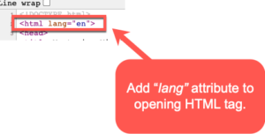
Set the page language
Add a lang attribute on the opening html tag to declare the primary language of the text in the page. This ensures that assistive technologies with support for multiple languages will read the content properly.
Setting language in “parts”
When a specific section of the web page contains content in another language, add a lang attribute to an element surrounding that content. See the image below for an example:

Use effective color contrast
Good color contrast draws interest to important content on your course site.
Why is this important?
It also benefits individuals who may have colorblindness or those with low vision. The Web Content Accessibility Guidelines (WCAG 1.4.3 opens a new window) states that the contrast ratio for small text (~12 pixels or below) should be at least 4.5:1. For large text (~18 pixels or above) is 3:1.
To check the color contrast in your course site, do the following:
- Download and install Colour Contrast Analyser (by Paciello Group) opens a new window.
- Next, review the YouTube video below on how to use the Colour Contrast Analyser (1:34):
ADDITIONAL GUIDANCE FOR COLOR CONTRAST: Meaningful information should NOT be conveyed by color alone.
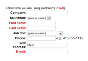
- E.g., the image below shows a web form with required fields identified by red text. If an individual is unable to see the color red, they would have difficulty filling out the form. A simple fix would be to add an asterisk(*) next to the required fields. This would then provide users who are unable to see red an additional piece of information to identify what is required.
Additional Resources
- Using the lang attribute opens a new window
- WebAIM: Document and Content Language attribute opens a new window
- WebAIM: Color and Contrast Accessibility opens a new window