The alt attribute (short for alternative text) is an attribute of the img tag and is meant to be an alternative for non-visual users (i.e., individuals who use a screen reader) when they encounter images on your website.
Screen reading applications cannot interpret images. For that reason, it is important that web designers and developers provide alt text that can be read aloud when the screen-reading application encounters an image. Below is an example of the ATI logo with an appropriate alt text description.
HTML Code Example
 alt="assistive technology initiative logo"/>
Another benefit of alt text is when an image does not load properly on a website. Instead of encountering a blank placeholder icon on the web page, the user will see the alt text displayed. This benefits all users as important can still be relayed to those individuals browsing your website.
Use empty “alt” tags for decorative images
Empty alt attributes hide decorative images, allowing screen reading applications to simply skip past them. This technique is useful for background images and aesthetic elements that hold no functional or instructional purpose.
Without an empty alt attribute, screen readers typically might read the filename of the image or simply indicate there is an image without an additional information. This can be confusing for individuals who are unable to see the image. Below is an example of the same ATI logo with an empty alt attribute.
HTML Code Example
alt=""/>Hyperlinks allow web designers to link their webpages, websites, and documents to one another. When hyperlinks are not labeled appropriately, however, they can be an accessibility barrier for some individuals with disabilities (i.e., individuals who are blind or have low vision or who have learning/cognitive challenges).
Relevant WCAG Guideline(s): WCAG 2.4.4 (Link Purpose, In Context) opens a new window, WCAG 2.4.9 (Link Purpose, Link Only) opens a new window
Use meaningful hyperlink text
As explained in the previous section, it is common for individuals who use screen readers (e.g., JAWS, NVDA, VoiceOver) to navigate a website by tabbing through the hyperlinks. For this reason, it is critically important that the hyperlink text provide information on where the user will be taken if they open the link. Review the examples below for more details:
Example of Poor Hyperlink Text
Below is an example of poor hyperlink text and the accompanying HTML code:
Sample Text:
Try reading this article about a Mason alum: https://cvpa.calendar.gmu.edu/lights-camera-action-2025-winter-showcase.
HTML code snippet:
https://www2.gmu.edu/focused-your-future/lights-camera-action-mason-alum-creates-own-film-festival.
Play the audio below to hear how that sentence sounds to an individual using a screen reader.
Example of Meaningful Hyperlink Text
Below is this same example using meaningful hyperlink text and the accompanying HTML code:
Sample Text:
Try reading this article about a Mason alum: Lights! Camera! Action! Mason Alum Creates Own Film Festival.
Play the audio below to hear how the sentence with meaningful hyperlink text sounds to an individual using a screen reader. In comparing this to the poor hyperlink text example, notice how the user is provided with information on where opening this link would take them.
Using aria-label to define hyperlinks
Another technique for describing a hyperlink’s purpose is the aria-label attribute. Let’s highlight a common examples of why this attribute would be used in place of meaningful hyperlink description:
- For design purposes, web developers would prefer to use repetitive hyperlink text like “learn more” or “read more” to avoid a long hyperlink text description
Example using aria-label
The image below references a Mason alum who created his own film festival. We have hidden the image from screen readers using a null tag (i.e., alt=””) and the hyperlink text is “Learn more…”. Unfortunately, the link text is a problem for screen reader users that require additional information in order to understand where the link would take them.
See below for how you could add an aria-label attribute to provide the information needed for a screen reader user, while keeping the aesthetics the web developer might prefer:
HTML code snippet with aria-label attribute:
aria-label="Lights! Camera! Action! Mason Alum Creates Own Music Festival"/>Learn more....
Now, the aria-label text is announced to the screen reader user instead of the hyperlink link (i.e., “Learn more…”).
Using aria-labelledby for long descriptions
Unlike aria-label, the aria-labelledby attribute is used when there is already text on the web page that can be used to define the link’s purpose or to provide a long description. Let’s look at the examples below:
Continuing the previous example, the image below now includes text above the image that references a Mason alum who created his own film festival. The image is hidden from screen readers using a null tag (i.e., alt=””) and the hyperlink text remains “Learn more…”.
Unfortunately, the link text is still not sufficient enough to provide screen reader users with the additional information they require in order to understand where the link would take them.
Example using aria-labelledby
The image below references a Mason alum who created his own film festival. We have hidden the image from screen readers using a null tag (i.e., alt=””) and the hyperlink text is “Learn more…”. Unfortunately, the link text is a problem for screen reader users that require additional information in order to understand where the link would take them.
Mason alum, Fernando Mico, is the creator and director of the Northern Virginia Film Festival.

HTML code snippet:
See below for how you could add an aria-labelledby attribute to provide the information needed for a screen reader user, while keeping the aesthetics the web developer might prefer:
HTML code snippet with aria-labelledby attribute:
The aria-labelledby attribute points to the NOVAfestival id tag, which will announce that information to the screen reader user when they encounter the link. In this instance, Learn more…Mason alum, Fernando Mico, is the creator and director of the Northern Virginia Film Festival.
How screen reader users interact with hyperlinks
A common technique used by developers when creating websites is the labeling of links with “Click here” or “Learn more”. To understand why this is an issue, you must understand one of the more common ways that screen reader users navigate a website.
Links List (or something like it)
When navigating websites, screen reader users commonly use a feature which allows them to list all of the links on a web page. This feature essentially streamlines the navigation process by allowing the end user to search the list for a specific link as opposed to using the TAB key to manually and sequentially navigate all of the links on the web page.
The example below shows the JAWS Links List with three different “Click here” links:
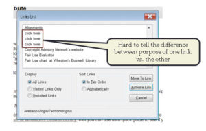
Here’s the problem: Links List features like the example above typically look for the hyperlink text that is provided by the web developer. If an end user simply navigates the website by looking through the list of hyperlinks, they would miss the contextual information needed to know where a “click here” or “learn more” link would take them.
Good color contrast draws interest to important content on your course site.
Why is this important?
It also benefits individuals who may have colorblindness or those with low vision. The Web Content Accessibility Guidelines (WCAG 1.4.3 opens a new window) states that the contrast ratio for small text (~12 pixels or below) should be at least 4.5:1. For large text (~18 pixels or above) is 3:1.
To check the color contrast in your course site, do the following:
- Download and install Colour Contrast Analyser (by Paciello Group) opens a new window.
- Next, review the YouTube video below on how to use the Colour Contrast Analyser (1:34):
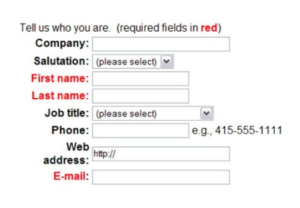
ADDITIONAL GUIDANCE FOR COLOR CONTRAST: Meaningful information should NOT be conveyed by color alone.
- E.g., the image below shows a web form with required fields identified by red text. If an individual is unable to see the color red, they would have difficulty filling out the form. A simple fix would be to add an asterisk(*) next to the required fields. This would then provide users who are unable to see red an additional piece of information to identify what is required.